Introduction
In our previous lab we conducted a scale-able field survey to understand the basics of how field surveys are
conducted. We constructed the field survey in the garden planter boxes in the
courtyard of Phillips Science Hall on the lower campus of the University of
Wisconsin Eau Claire. In the planter boxes we first sectioned off a 1 meter
square area, and leveled the snow in the area with the top of the box, then we constructed
a land scape and added the following features in snow: a ridge, hill,
depression, valley and a plain. In the last survey we constructed a grid out of
push pins and string in the 1 meter square area, by overlapping the string we
created a grid pattern, made up of 5cm2 (20x20), with a total sample
of 400 possible data points. We then sampled each square for a “Z” measurement
made up of a positive of negative elevation from the level surface of the snow
which we made “sea level” with a 0 value. Once the data was captured, we put
the grid and elevation values into excel and examined the data.
(For
photos and further explanation, please see my first post Ex 1: Sandbox Survey)
Now
that we have the data from our survey in excel, in today’s lab we will be
normalizing our data, or taking the data that we have and factoring out the true
size of the data to transform the data in to a standard measure, which we can
work with. We will do this by turning our data points into a list of XYZ
coordinates in excel, and then using these coordinates to map a continuous surface.
Then we would use various interpolation methods to create an estimation of
surface values at unsampled points based on known surface values of surrounding
points. By doing this in ArcScene we can visualize our data points in three
dimensions and see how accurate our surveying method was.
Methods
The first thing we did was, to
take the data that we had entered into excel the first time and correct it such
that it could be loaded into ArcMap as XYZ coordinates.
 |
| Fig 1: Table of entered data, fresh from the first survey. While this was an easy way to examine our data, it could not be used in ArcMap. |
 |
| Fig 2: Corrected XYZ data which can be used in ArcMap |
Once our data was loaded into ArcMap
as a points feature class, we created a shapefile, and then turned the shape
file into a layer file and added that file to a geodatabase. From there the
file could be opened in ArcScene and a 3 dimensional picture of our data points
took shape.
 |
| Fig 3. Data points in ArcMap. |
Now that we had our data in ArcMap,
we had to decided which method of data interpolation would be best to visually
convey our data with the most accuracy. Data interpolation will predict the value of cells in a raster that may have missing our limited numbers of data points. The following data interpolation methods have various advantages and disadvantages. Below is a picture of survey data before any interpolation methods were applied.
 |
| Fig 4. Data points in ArcScene with no interpolation. |
IDW Interpolation: Stands for Inverse Distance Weighted. This method of interpolation uses a method of predicating cell values based on the average of the values of the data in the neighboring cells. The closer a point is to the center of the cell being estimated, the more influence, or weight, it has in the averaging process.
The inverse distance weights do have limitations, as IDW is an average, it cannot be used to generate surfaces in areas that have lower values than the lowest input that is in the data, or the highest value that is in the data. Therefore if a data point at high or low elevation is not directly captured then IDW will not be able to model those points accurately. Therefore if a ridge or value is not captured in the surveying process it can not be generated by this interpolation process. This means that in order for this model to accurately represent data of various elevations, a dense sampling technique is needed. (ArcGIS 10.3.1 Help)
Natural Neighbors: This interpolation method finds the closest subset of samples to a particular point and then applies weights to them based on proportionate areas to find a value of a point that is not represented. Again this method is unable to create data points of peaks, ridges, pits or valleys that have not been surveyed.(ArcGIS 10.3.1 Help)
Kriging Interpolation: is from a second family of interpolation methods which is based on statistical models that include autocorrelation such that, the statistical relationships among the measured points. Because of this, geostatistical techniques not only have the capability of producing a prediction surface but also provide some measure of the certainty or accuracy of the predictions. (ArcGIS 10.3.1 Help)
Spline Interpolation: This method uses a mathematical function that minimizes overall surface curvature, resulting in a smooth surface that passes exactly through the input points. Spline operates on two premises. 1) The surface must pass exactly through the data points. The surface must have minimum curvature. 2) The cumulative sum of the squares of the second derivative terms of the surface taken over each point on the surface must be a minimum.
TIN Interpolation: The purpose of the Raster To TIN tool is to create a triangulated irregular network (TIN) whose surface does not deviate from the input raster by more than a specified Z tolerance. The negatives of a TIN interpolation are that the continuous surface that is generated will not have any smooth or rounded surfaces, meaning that while the the TIN network will show peaks (to a point) it will not show an accurate depiction of the landscape, but rather specific surveyed points.
Once the data was in ArcScene and we knew a little about the advantages and disadvantages of each interpolation method, we tested each interpolation method out in order to decide which most accurately represented our constructed terrain. One important correction that we had to make was to adjust for the drastic highs and lows that the 3D interpolation models suggested for our peaks and valleys. (see fig 5 Below). While this is represented below in a TIN network, this was done for all interpolation methods.
 |
| Fig 5. A Tin interpolation of our data with uncorrected peaks and ridges. |
In order to correct for this, the layer properties of the surface was normalized such that a factor of .25 was used to convert every elevation value into a more accurate surface. (see Fig 6 below).
 |
Fig 6. A conversion factor of .25 was used to scale the proportions of the elevation into a more accurate representation of the true constructed terrain.
|
When contrasting the 2D map with its 3D counterpart, the best comparison came when both representations were in the same orientation in ArcScene as in ArcMap. Having determined the orientation, a scale bar was created to reflect the true size of the 3D model in comparison to the 2D model, as showing the 3D surfaces changes the perception of size in the model and may disproportionally make the 3D model appear larger than its 2D counterpart.
Results/Discussion
Each method of Interpolation is shown below in a map such that their is a juxtaposition of the 2D and 3D models for each data set. Now the question becomes how well does the interpolation model match our survey and the terrain we surveyed.
 |
| Fig 7. A reminder of the created terrain, |
Kriging Interpolation:
 |
| Fig 8. Kriging Interpolation method of surveyed terrain |
The Kriging interpolation method averages out a lot of the surface terrain, and rounds it out to a great extent. The first issue that I would point out is the top of the mountain in the upper left hand corner of the 3D model (fig 8), the surface of this feature has been rounded off and dose not show any of the sharp edges that the feature truly had. Similarly, this theme is repeated in the valleys, where the sides of the valley did not appear as steep nor did the ultimate depth of the valleys appear to be as extreme as we had surveyed them. The ability of the Kriging interpolation to average the terrain may work better at a larger scale or on terrain that has more gradual inclines, but it does not match our data very well.
Spline Interpolation
 |
| Fig 9. Spline Interpolation |
The best method of interpolation has to be between the spline (fig 9, above) method and natural neighbors (fig 10, below). While both methods did not capture the details of the hill in its entirety, they did the best job of capturing the ridge, the valley, and the depression. While looking at the 3D models of each method they do both look quite similar, however when looking at the 2D model, Natural Neighbors was able to show more details on average depth of the valley, which appears to be slightly different in the Natural Neighbors 3D representation (fig 10). While the ridge was not as represented in the 2D model of Natural Neighbors, comparison to the spline interpolation method dose not appear to have a drastic difference in the 3D model between the two. With this in mind I would have to say that Natural Neighbors was the best in representing our survey, even though it did have some drawbacks.
Natural Neighbors
 |
| Fig 10. Natural Neighbors |
 |
| Fig 11. IDW Interpolation |
IDW Interpolation was a very accurate method in representing our hill, again in the upper right hand corner (fig 11). IDW's ability to layer the elevation of the hill and contrast each layer really serves to build up the hill in contrast to the plains upon which it sits. IDW does not do a very good job in representing the ridges on the far right of the map. While it does shoe that these ridges are higher than the surrounding area, it does not model them to have a distinct ridge or sharp edge at their peak which our model dose not necessarily portray drastically but it is more present than what is depicted here.
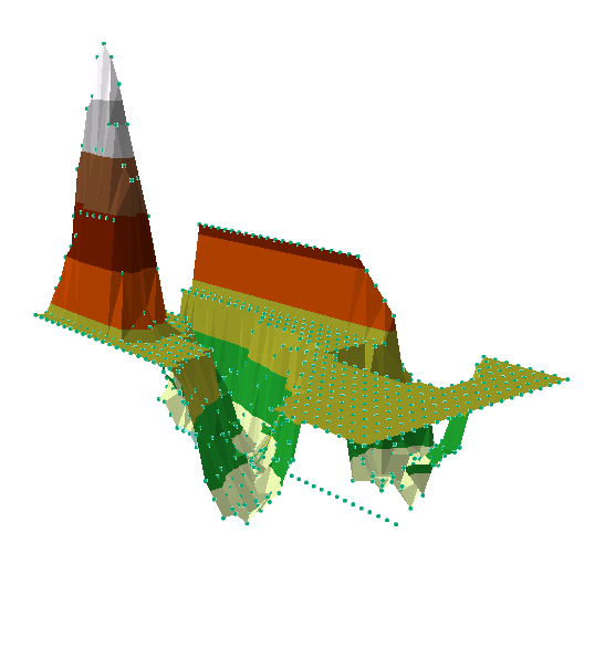
TIN Interpolation
 |
| Fig 12. TIN Interpolation |
While TIN interpolation was probably the least accurate in terms of representing the natural curvature of the features that were created, this method was a personal favorite of mine. TIN networking really shows off actual elevation of the specific points that we surveyed and does a very good job of portraying the survey points relative to each other due to its category breakdown for elevation. For example the individual points that we captured on the top of the hill are captured in the 3D model to a more accurate extent as opposed to some of the other interpolation methods, as well as the peaks of the ridge on the right side of the map. The negative of the TIN network are that the model does not do gradual changes or stepped survey points, it rather averages these points into a flat surface. This dose not leave the best relief of the features we created. While TIN does have negatives, TIN also happens to look like early video games and reminds me of my childhood. While I can see its uses for interpolation data I would not say that it did the best job of representing our survey in a 3D model.
Revisit your survey (Results Part 2)
For the next part of our survey, we had to note which interpolation method matched our data and terrain the best and then reconstruct and resurvey those points that were lacking in an attempt to improve our model. While the best interpolation method was Natural Neighbors, as noted above, the model lacked accuracy when it came to the hill data, and as a general trend in all the models, none of the interpolation models did a fantastic job of capturing the valley.
On a very cold day ( a balmy 3 degrees), we remade our terrain in same planter box in the Phillips Science hall court yard in Eau Claire. We attempted to match our previous terrain as best as we could, but the snow did not compact in the same way as it had when we had constructed our first model. This translated into features that did not have stark ridges or edges, but rather crumbling terrain.
For our second survey we wanted to capture data in greater detail so we constructed a double grid, such that our first grid of 20 x 20 with 5 square CM individual squares was the base of an identical grid now shifted 2.5 cm up on the Y axis which ran East to West in all of our maps (fig 15). The second grid was constructed using the same push pin technique with a different colored thread so that we could tell the two grids apart. We then focused surveying on the specific features, their edges, and elevations such that more sample points were created in places that had a none zero elevation.
 |
| Fig 13. The construction of the double grid. |
 |
| Fig 14. second survey with single grid. General terrain features were attempted to be captured and reconstructed from our first survey. |
Our double grid did give us more survey points around the features we wanted to capture, and were able to capture double the survey points as in our first survey, however only expanding the Y axis of our survey created an elongated map and 3D model. So while our new Natural Neighbors interpolation (fig 16, below) has more accurate elevations, it is skewed to have a double length and singular width, and actually causes our 2nd survey models and maps to appear disproportionate.
 |
| Fig 16. |
Part 5: Summary/Conclusions
While the second survey did increase the number of data points that we were able to gather more data, it did not appear to have increased our modeling accuracy. As to whether this was a result of our survey techniques or grid creation I am not sure, but I would predict that increasing the number of data points in a specific area would increase the resolution of the map and model and therefore increase the accuracy of the Interpolation, no matter which method was chosen. I do not think that such a detailed ground survey would always be realistic given that there would be a great deal of data points and such a vast distance in which people would have to move in order to capture those points. There would be to many logistical issues to cover to capture that many moving pieces.
Interpolation can be used to infer data in many instances such as rainfall, temperature, chemical dispersion, or other spatially-based phenomena.


